Planning a drone light show that fits the event
Start with the audience, the site, and the event beat that deserves a skyward point of view.
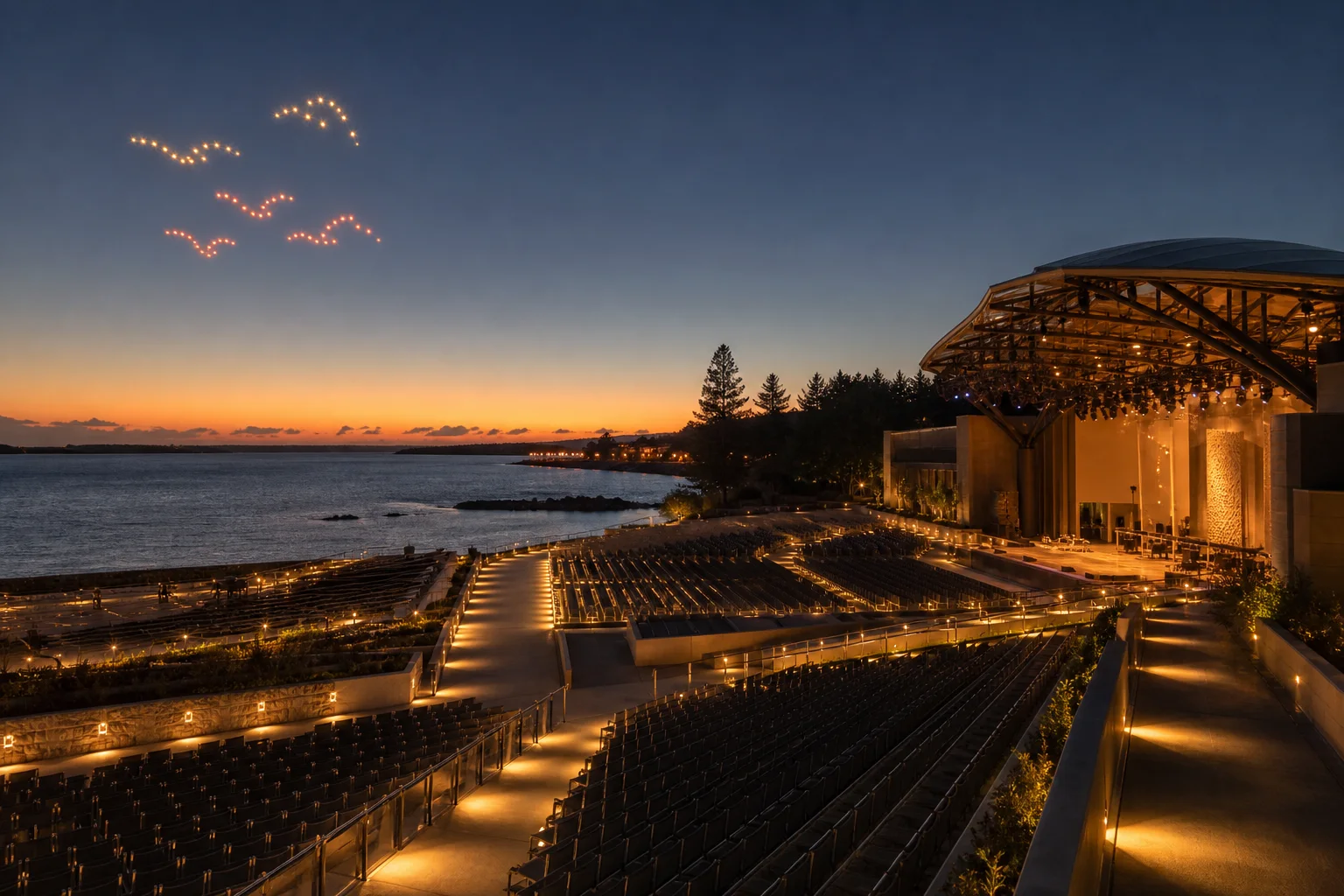
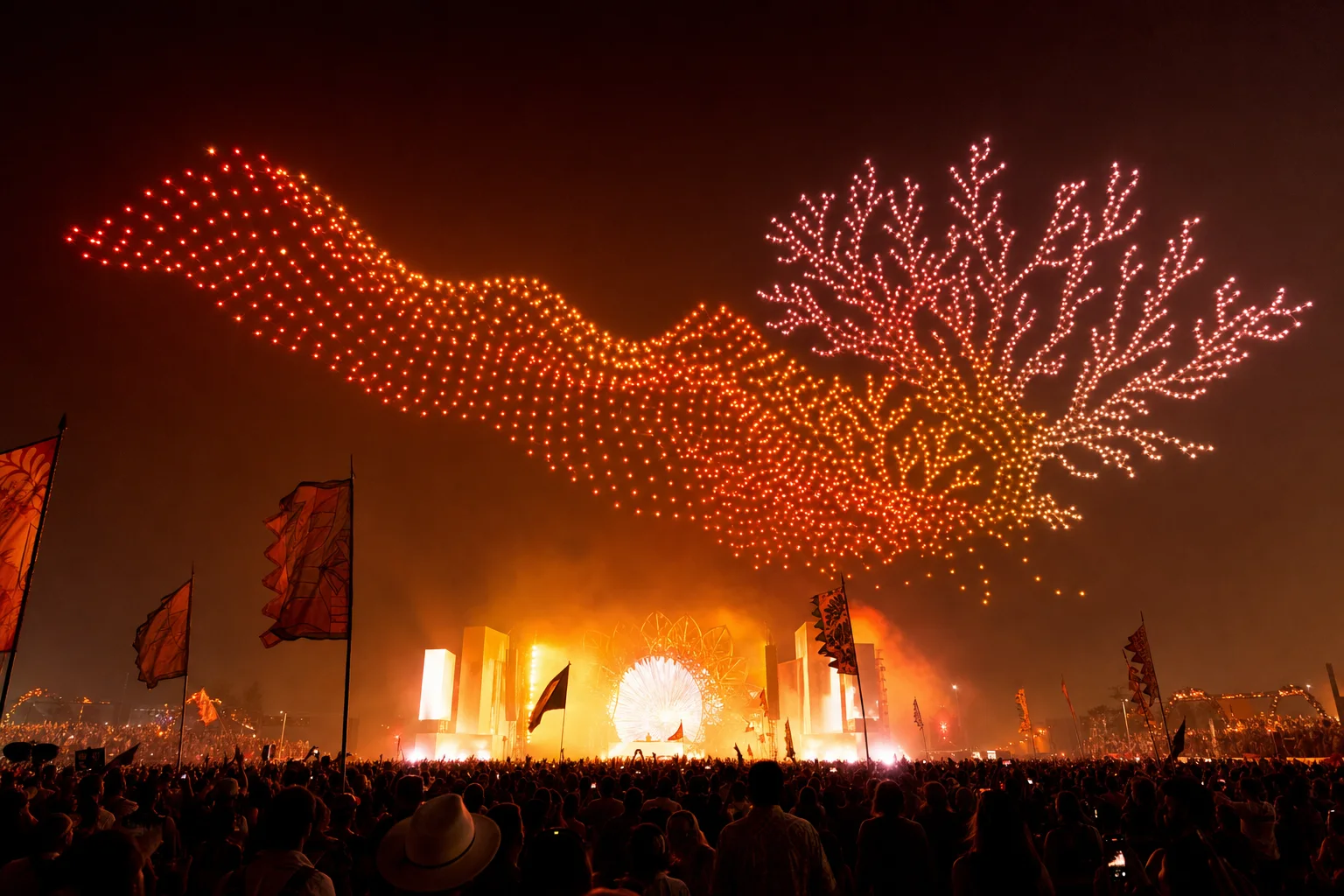
When an event needs a defining moment, a coordinated sky can turn a shared experience into a lasting memory. The strongest drone shows begin with the audience, the venue, and the story the event wants to tell.
The production brief
A drone show creates a physical, shared moment above the audience. It has scale, movement, and a sense of place that a screen cannot reproduce—an ideal canvas for an event that wants to feel truly present.
For a brand activation, every formation can be designed around a visual cue, product silhouette, or signature color system. LumaFleet translates the brief into a timed aerial sequence that feels native to the night sky.
"The best drone shows make the sky feel like part of the event—not a screen above it."
Drone shows vs. fireworks
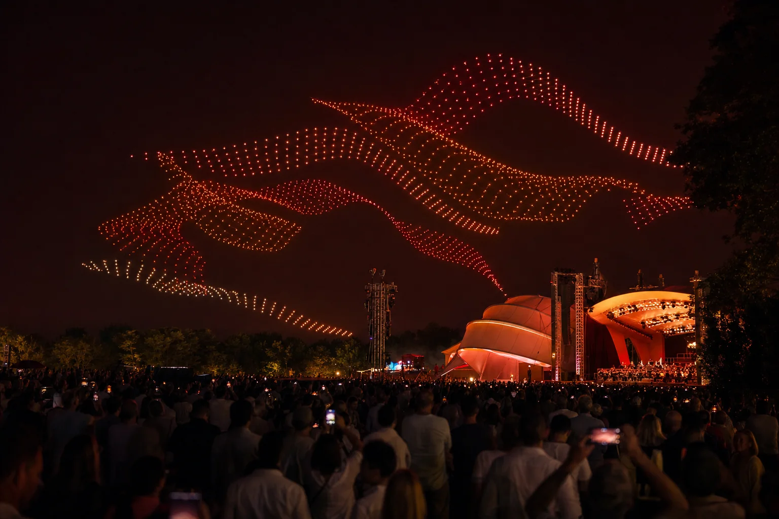
A common pitfall is treating the sky like a flat billboard. The strongest formations use negative space, recognizable silhouettes, and transitions that respect the audience’s viewing distance.
Instead of filling every second with motion, the show should give each formation room to land. A clean sequence lets an audience recognize the image, feel the shift, and anticipate what comes next.
-
Use color progression, negative space, and carefully timed transitions to give an aerial formation depth and emotional rhythm.
-
Use transitions, pauses, and changes in altitude to create breathing room between formations.
-
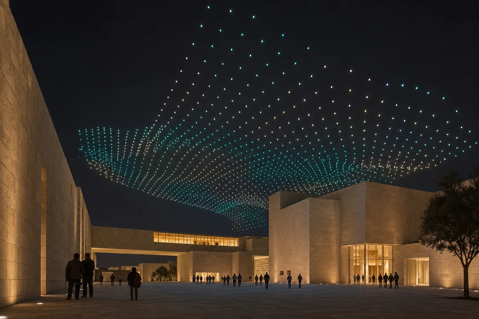
Consider the full event context, including venue access, audience flow, responsible operations, and the production footprint.
A sky worth planning
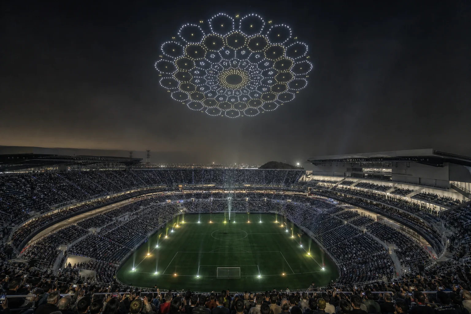
The sky is the canvas. With precise spacing, musical timing, and responsible flight planning, a drone show can make a venue feel larger, more connected, and completely transformed.